Design system
Design system introduction
This simple design system acts as the foundation for all pages and content on nicovanzyl.com and any other sites that need to feel cohesive and part of the brand. Even though the site is relatively small and maintained by one person, it gives agents a foundation to follow and makes new pages more deterministic, like templates, but still freeform enough to be creative.
Colours
Typography
Use Söhne for text and Special Gothic for the wordmark. Use spacing and color for hierarchy; headings can stay body-sized.
Reading body: 18 / 31.5px desktop, 16 / 24px mobile. Shared non-reading body leading: 28px. The bundled Söhne face is regular; do not synthesize bold.
Spacing & geometry
--space-14px8--space-28px22--space-312px10--space-416px21--space-624px7--space-832px3--space-1248px2--space-1664px0--space-2496px0--space-32128px0- Column
- 608px maximum · --layout-reading-width1
- Mobile
- 48px side gutters at ≤640px10
- Paragraph
- 28px desktop / 24px mobile8
- Section
- 56px desktop / 48px mobile10
- Related
- 16px from section heading to content21
- Targets
- 44px minimum · --control-target5
Motion
- Page entry
- 500ms · 4px · bounded stagger5
- Content
- 400ms · 8px on subsequent changes7
Use the shared entry and scroll-reveal lifecycles. Keep separate elements for separate motion owners. Reduced motion, focus and print expose readable content; hidden tabs cancel active work. This reference keeps its documentation static.
Audio
Two short cues for interaction feedback. Previews use the same tokens and cached audio buffers as the site.
Hover
audioCueTokens.hoverEntering an interactive control with a mouse.
White noise · 6000Hz bandpass · gain 0.11
Triangle · 2500Hz · gain 0.024
Attack · 1.5ms · decay 5 / 8ms
Click
audioCueTokens.clickActivating a control.
White noise · 4600Hz bandpass · gain 0.105
Triangle · 1900Hz · gain 0.032
Attack · 1.5ms · decay 6.5 / 11ms
- Buffer
- 120ms · rendered once and cached1
- Peak limit
- 0.08 · attenuate only; never amplify2
- Hover interval
- 70ms minimum1
- Pen release
- 80ms after the press cue1
Use one cue per interaction. Audio supplements visible feedback and never plays on page load. Hidden tabs and reduced motion suppress UI audio. These preview buttons support mouse, keyboard and touch. Game audio stays separate.
Individual elements: text, headings, icons and buttons.
Heading & Text
Semantic levels are separate from visual size. Primary copy, secondary explanation, and an inline link.
A section title
Body text. Principles.
Secondary text.
Usage
<Heading as="h2" tone="secondary">A section title</Heading>
<Text>Body text.</Text>
<Text tone="secondary">Supporting context.</Text>
ActionButton & ArrowIcon
A solid call to action, an optional directional icon, and a native disabled state. Links receive href; actions receive onClick.
Action is off. Activate to try the pressed state.
Usage
<ActionButton arrow onClick={onToggle} aria-pressed={active}>
  Try action
</ActionButton>
<ActionButton disabled>Unavailable</ActionButton>
Groups of atoms with one function: sections, controls, facts, links and media.
SegmentedControl + Principle
Switch the content density. The radio group supports arrows, Home and End. A principle pairs a margin number, linked heading and optional explanation.
Understand intent.
Start with what someone is trying to achieve and why it matters. Consider their circumstances, and make it easy to correct assumptions as their needs change.
Usage
<SegmentedControl label="Content density"
  options={["Concise", "Full"]} value={density} onChange={setDensity} />
<Principle id="intent" headingId="intent-title" number="01"
  title="Understand intent." href="/principles#1"
  description={density === "Full" ? description : undefined} />
ContentSection + FactList
The section owns its heading gap. Facts keep labels and values aligned, then adapt to the available reading width.
Details
- Role
- Design engineer
- Focus
- Product, engineering & brand
Usage
<ContentSection title="Details">
  <FactList items={[
    { label: "Role", value: "Design engineer" },
    { label: "Focus", value: "Product, engineering & brand" },
  ]} />
</ContentSection>
LinkRow
An inline title and description with a stable 44px arrow column. The Delivered organism owns the list spacing and responsive truncation.
Usage
<div className="work-shipped"><ul>
  <li><LinkRow title="Selected work" description="Products and systems."
    href="/work" /></li>
</ul></div>
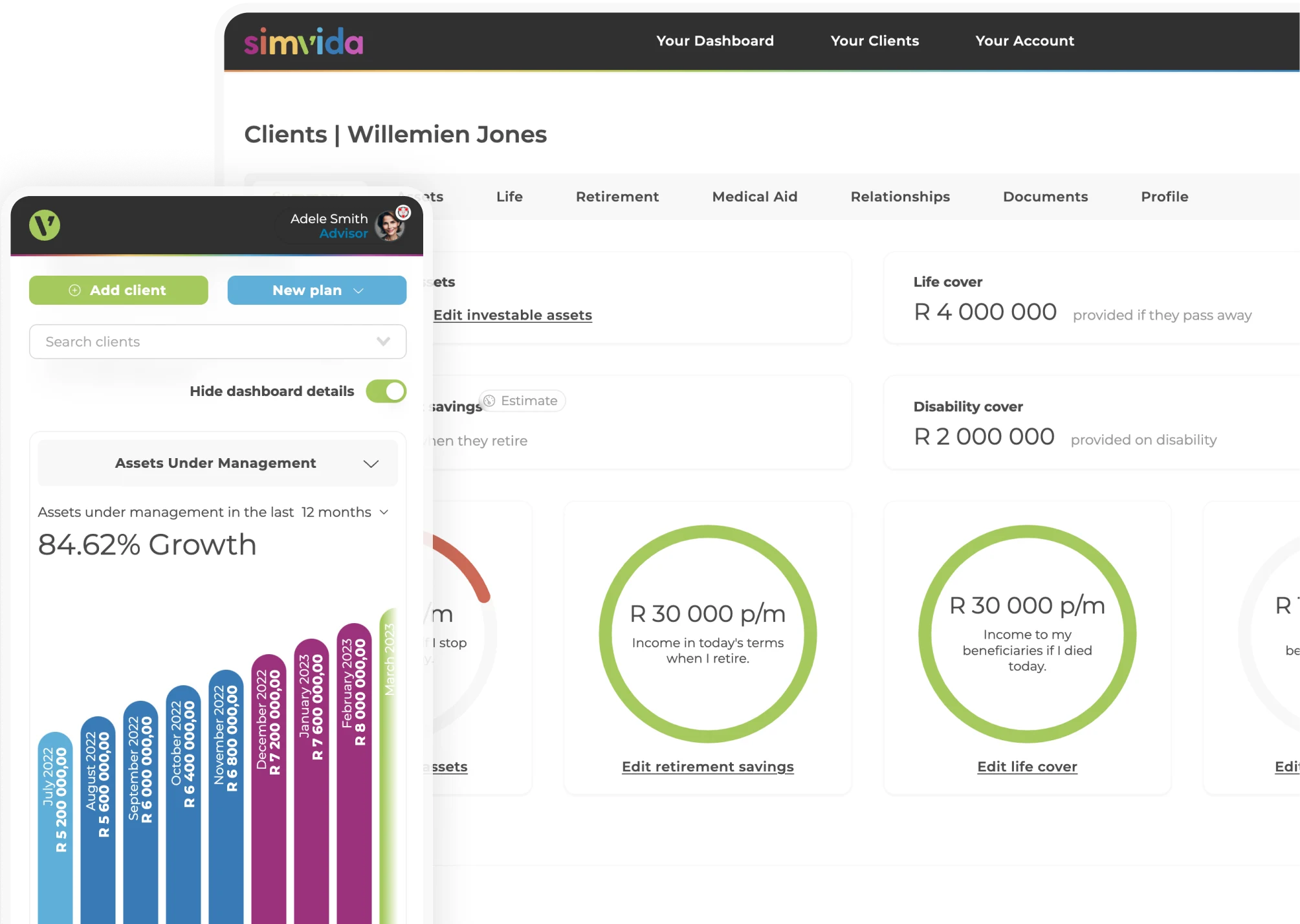
MediaFigure
Responsive image, meaningful alt text, intrinsic dimensions and an optional caption. Media keeps its composition and loads lazily unless marked as a priority.
Usage
<MediaFigure image={{ id: "preview", src: "/work/simvida-workspace-overview.webp",
  alt: "Simvida workspace on desktop and mobile", width: 2009, height: 1428,
  caption: "Adviser workspace", responsive: true }} />
BioEmailButton
An action with clipboard feedback. The action variant reserves space for every label, preserving its size through hover, focus and copied states.
Usage
<BioEmailButton variant="action" label="Get in touch"
  hoverLabel="nico@vanzyl.co" surface="design-system" />
Sections composed from molecules, with their own content and interactions.
BioTestimonials
The same testimonial carousel used on About and LFG, with real attribution, keyboard controls and announced changes.
Testimonials
Usage
<BioTestimonials contentLevel={3} headingLevel={3} />WorkExperience
One company’s heading, facts, highlights, delivered links and media. Content lives separately in work-content.ts. Expand to inspect a complete composition.
View a complete work section
Altostrat2025
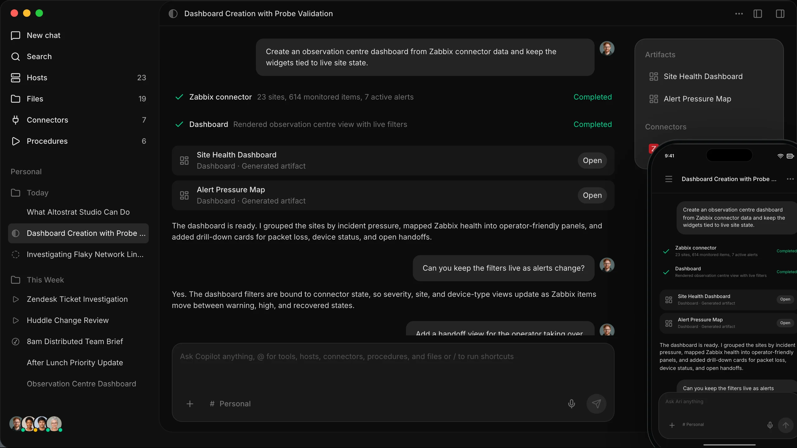
Altostrat is building the tools and infrastructure to help NetOps teams become AI-native. As founding designer I lead product design and development alongside brand and everything in between.
- Role
- Head of Product Design
- Period
- 2025 — Present
- Focus
- Product, engineering & brand
Highlights
- Shipped Studio in three months with one other engineer.
- Introduced the Save for Later pattern for agent responses.
- Defined the brand for Altostrat.
- Quickly iterating and prototyping new ways NetOps teams can work with AI.
Delivered
- Studio Desktop AI, automation and collaboration for NetOps teams.
- Studio Remote The iOS and Android companion app for Studio.
- Activate Onboarding experience for teams to Altostrat.
- Partners Partner experience and earnings calculator.
- Website Marketing website design and development.
- Brand Identity and visual language system.


Usage
<WorkExperience item={experience} contentLevel={3}
onRevealDetail={revealDetailAndExpandContent} />Identity, theme picker, navigation and optional density control. Reused at the top of this page.
Contact links, email copy and local-time comparison.
Accessible questions and answer regions, with optional Scribe input. Keep its streaming, error and find-in-page behavior together.
Company marks with a shared motion lifecycle. Used by Work and LFG.
The shared reading measure and preview semantics. About, Principles, Work and this reference use it.
Templates define layout. Pages supply content, state and navigation.
ReadingPageTemplate
The site shell: a header and content column, with separate slots for optional tools and footer experiences. Work retains native document scrolling; other reading pages retain the existing inner scroller.
Usage
<ReadingPageTemplate ref={pageRef} footer={<Footer />} tools={<DevGrid />} >
  <BioHeader activeSection="about" />
  <AboutPageTemplate intro={intro} connect={connect}
    testimonials={testimonials} questions={questions} />
</ReadingPageTemplate>
AboutPageTemplate
An actual template instance with sample content. Introduction, contact, social proof and questions keep the biography’s order and spacing.
Introduction.
Connect
Social proof
Testimonial and attribution.
Questions
Questions and answers.
Usage
<AboutPageTemplate
  intro={<Text>Introduction</Text>}
  connect={<BioConnect />}
  testimonials={<BioTestimonials />}
  questions={<BioFaq />}
/>
Principles & Work compositions
Principles uses ContentArticle’s principles variant and a sequence of Principle molecules. Work uses its work variant, LfgClientLogos and WorkExperience organisms. Both are composed inside ReadingPageTemplate; their page controllers own fragment navigation, density and preview state.
Tokens → Heading + Text
       → Principle
       → ContentArticle (principles)
       → ReadingPageTemplate
       → /principles

Tokens → ArrowIcon + Text
       → FactList + LinkRow + MediaFigure
       → WorkExperience
       → ReadingPageTemplate
       → /work
Components and templates used by each page.
ReadingPageTemplate + AboutPageTemplate; contact, testimonials and FAQ organisms.
ReadingPageTemplate + ContentArticle + ten data-driven Principle molecules.
ReadingPageTemplate + ContentArticle + WorkExperience, facts, links and media.
ReadingPageTemplate with its offer layout; shared ActionButton, SegmentedControl, contact, testimonials and FAQ.
Specialist spatial canvas, zoom controls and media viewer. Keep its rendering and navigation lifecycle separate.
Specialist maker, material controls, previews and exports. Reuses the identity and action primitives.
Component examples and usage, rendered with the shared reading template.
Objects & specialist surfaces
The metal glyph, theme picker, jewel cases, pins and Slayer game have dedicated rendering, physics and audio. Keep those effects within their components.
Custom hi-* pages are intentionally deferred. Their bespoke art direction is not a source for new global tokens or reading-page components.
Layout rulers
Show the grid and rulers by default on this page. Press Shift+G to toggle them off or on. Rulers include the logo and section-number margin column, its gap to the text and a matching column on the right, container width, section boundaries and gaps, and update when the layout changes. Guides do not affect layout or interaction. The grid starts at the top center. Use Grid & layout to adjust dimensions in 4px steps; Reset layout restores responsive defaults.
Index links
Set index numbers at the same font size as their labels. Underline only the link text, never the number or the gap. Keep the whole row clickable.
Writing
Use direct labels and factual descriptions. Include text only when it identifies something, explains its use or constraints, or helps someone act. No slogans, decorative introductions, vague claims or copy describing the page’s own character. Remove filler instead of replacing it with another slogan.
Adding to the system
- Start with a semantic token or existing component.
- Place a reusable element at the smallest useful atomic level.
- Keep page content and route behavior outside the primitive.
- Add a live example and usage snippet here.
- Check narrow screens, both baseline palettes, keyboard focus, reduced motion and direct links.
Source of truth: src/design-system/, src/design-tokens.css and DESIGN.md. Existing specialist organisms stay in src/components/ to preserve their loading boundaries. Import leaf modules in production.